
UP NEXT

Alfe Édit
Branding, Webdesign, Social Media
ABOUT THE PROJECT
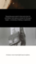
Aarco Studio partnered with Alfe Edit to shape a minimalist brand identity, design a highly visual editorial website, and define a cohesive social media presence.
The project focused on clarity, visual storytelling, and restraint; creating a digital space that feels personal, aesthetic, and intentionally curated.
Brand Identity
Creative Direction
Website Design
Content & Visual Direction
Social Media Strategy

OVERVIEW
Alfe Edit is a curated digital platform exploring beautiful places, ideas, and people.
More than a blog, it is an editorial project driven by taste, sensitivity, and a strong sense of personal curation. The ambition was to create a space that feels calm, refined, and visually immersive, a place where content is experienced rather than consumed.
Alfe Edit approached Aarco Studio to translate this vision into a clear brand identity and a digital presence that reflects its aesthetic values while remaining authentic and approachable.

THE CHALLENGE
The challenge was to design a brand and platform that balances minimalism with emotion.
Alfe Edit needed to feel personal without being casual, elevated without feeling distant, and visual without overwhelming the narrative. The experience had to give space to imagery while preserving the intimacy of storytelling.
Every element needed to feel intentional — nothing excessive, nothing decorative for the sake of it.


OUR APPROACH
We approached Alfe Edit as an editorial universe rather than a traditional brand.
Our focus was on creating clarity through restraint, allowing visuals and words to coexist naturally. We worked closely with the founder to define a creative direction rooted in simplicity, sensitivity, and coherence.
Rather than following trends, we chose to build a framework that could evolve organically with the content — timeless, flexible, and emotionally grounded.


Social Media Direction
The brand identity was designed to quietly support the content, never overpower it.
We developed a natural colour palette inspired by architecture, landscapes, and interiors — tones that adapt effortlessly to different places and moods.
Typography was kept deliberately simple, using a single typeface for both titles and body text. This choice reinforces visual harmony and creates a smooth, editorial rhythm throughout the platform. The logo remains minimal and discreet, acting as a signature rather than a statement.


Brand Identity
The brand identity was designed to quietly support the content, never overpower it.
We developed a natural colour palette inspired by architecture, landscapes, and interiors — tones that adapt effortlessly to different places and moods.
Typography was kept deliberately simple, using a single typeface for both titles and body text. This choice reinforces visual harmony and creates a smooth, editorial rhythm throughout the platform. The logo remains minimal and discreet, acting as a signature rather than a statement.


Website Experience
The website was designed as a visual-first experience.
The homepage acts as an entry point into the Alfe Edit universe, immediately immersing visitors through strong imagery and a clean, spacious layout. Articles are presented as visual stories, inviting exploration rather than directing attention through hierarchy.
Each article page follows a blog-inspired structure, elevated through spacing, typography, and image placement. The design gives equal importance to visuals and text, creating a reading experience that feels calm, intimate, and unforced.


The Outcome
Alfe Edit now exists as a clear and intentional digital space. The brand, website, and social presence work together to express a refined editorial identity — one that values emotion, simplicity, and authenticity. The result is a platform that feels personal yet elevated, visual yet thoughtful, and designed to grow naturally over time.